
In many organisations, the slightest movement in an indicator triggers a reaction. A figure that is higher or lower than the day before is enough to mobilise a team and schedule a corrective action. This vigilance seems legitimate, given how heavily quality requirements weigh on processes.
Yet not every deviation carries the same meaning. Some reflect the normal functioning of a process, with its unavoidable random fluctuations. Others reveal a genuine change, a drift, an anomaly that calls for intervention. Confusing the two leads to acting when you should be observing, and observing when you should be acting.
Control charts, drawn from Statistical Process Control, provide a structured answer to this confusion. They offer a visual and statistical reading that separates normal variation from a signal of anomaly, and they transform the way an organisation steers its processes.
The confusion between variation and anomaly
A process is never perfectly stable. Even under the most tightly controlled conditions, its results fluctuate from one measurement to the next, and that fluctuation does not necessarily reflect a malfunction.
In many companies, this statistical reality remains poorly understood. Every deviation is interpreted as the symptom of a problem to be solved. A random fluctuation is then corrected as if it were a root cause, and the intervention ends up degrading what it claimed to improve.
Two kinds of variation: common and special
The statistical approach distinguishes two types of variation with very different origins. Common cause variation corresponds to the noise inherent in the process, the sum of many small causes that it would be futile to tackle one by one. Special cause variation, by contrast, results from an identifiable event outside normal operation.
This distinction changes everything. Common cause variation is reduced by modifying the design of the process itself. Special cause variation is addressed by identifying the specific cause that produced it. Confusing the two leads to two symmetrical dead ends.
Understanding control limits
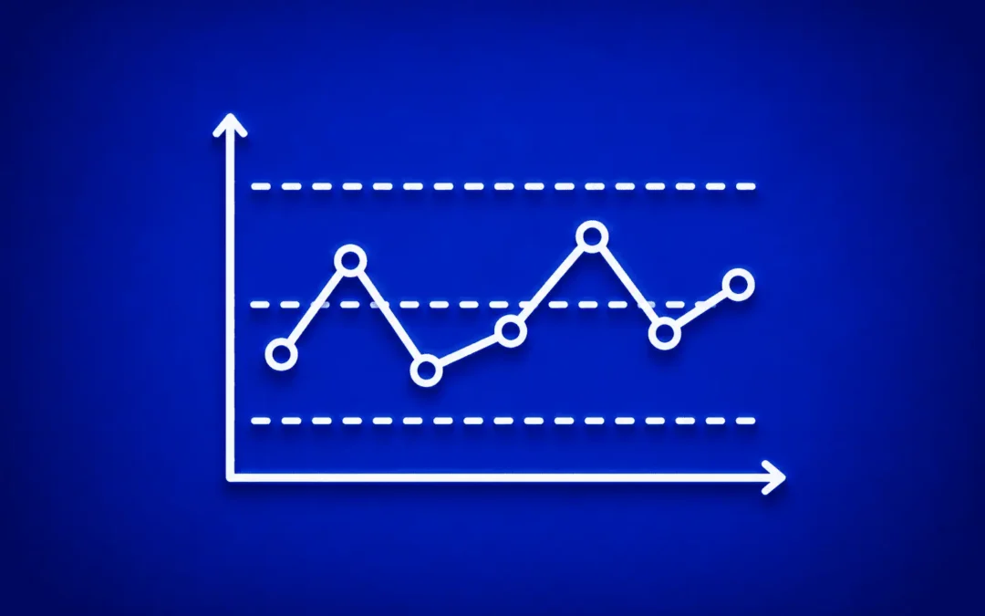
Control charts show how an indicator evolves over time, framed by two lines: the upper limit and the lower limit. As long as the points remain inside those limits and are distributed naturally around the mean, the process is considered to be in statistical control.
These limits are not set by decree. They correspond neither to a customer tolerance nor to an internal target. They are calculated from the process data itself, from its observed variability. A chart does not say whether a result is good or bad from a commercial point of view: it says whether the process that produced it is behaving stably or has changed.
The signals that should raise a flag
A process in control produces points scattered around the mean, with no particular structure. Several configurations, on the other hand, indicate that something has changed and deserve analysis:
- a point falling beyond a control limit
- a long trend of points running in the same direction
- a run of consecutive points on one side of the mean
- regular cycles or repeating patterns
- variability that widens or tightens abnormally
These signals do not assert that a defect is present. They indicate that a special cause has probably entered the process, and that it is now legitimate to go looking for it.
The trap of over-steering
Without a statistical reading, the temptation to react to every variation is strong. A point below the mean triggers one action, a point above it triggers another. Each adjustment is meant to be corrective, but it alters a process that was not at fault.
This over-reaction produces a paradoxical effect: it amplifies variability instead of reducing it. The process, constantly shaken by unnecessary corrections, becomes more unstable than it was. Over-steering exhausts teams as much as it degrades results.
The trap of under-steering
At the other extreme, an organisation that ignores real signals slips into under-steering. A slow drift sets in without anyone noticing, because no point spectacularly exceeds the limits.
Control charts make these gradual drifts visible: a run of points on the same side of the mean, or a gentle but continuous trend, signals a change that escapes the naked eye. Without this reading, the process drifts until it produces defects, and the correction costs far more than an early reaction would have required.
Control charts within the DMAIC approach
Within DMAIC, control charts come in mainly at the Control stage, the one aimed at sustaining the gains achieved. Once the process has been improved, they make it possible to verify over time that the new performance is holding.
Their usefulness is not limited to that phase, however. As early as the Measure phase, they characterise the initial variability of the process; in the Analyze phase, they help distinguish structural causes from one-off events. This continuity makes them a cross-cutting tool rather than a mere end-of-project monitoring device.
The role of management in using control charts
Like most Lean Six Sigma tools, the effectiveness of control charts depends largely on the managerial posture. The tool can be diverted into an instrument for monitoring people, or mobilised as a shared language about the state of the processes.
When every out-of-limits point triggers a search for an individual culprit, teams quickly learn to hide data or adjust measurements, and the reading loses its diagnostic value.
When the analysis is collective and geared towards understanding the system, control charts become a basis for dialogue. Teams take ownership of the tool and flag anomalies earlier. The managerial posture determines the value of the information produced.
From reaction to lasting stability
Adopting control charts means giving up the reflex that pushes you to react immediately to every deviation. It means accepting that a living process fluctuates, while knowing how to separate noise from signal.
This discipline transforms the organisation’s relationship with its own processes. Decisions become less emotional and better grounded in facts, and effort concentrates where it genuinely creates value.
Control charts replace neither human analysis nor domain expertise. They provide a framework that makes that analysis more accurate and more economical. They then become far more than a monitoring tool. They become an instrument of management in the service of lasting performance.
Key takeaways
- Control charts tell normal variation apart from an anomaly
- A stable process fluctuates naturally around its mean
- Common cause variation reflects the normal functioning of the process
- Special cause variation reflects an identifiable change
- Control limits are calculated, not decreed
- Several visual signals warn of a loss of control
- Over-steering degrades the processes it claims to improve
- Under-steering lets silent drifts take hold